Week 11 – Exchange

The last form of rhetoric we learned about was the of exchange.

According to Jaques Durand “exchange consists of two reciprocal phrases” and occurs between the image or text in an advertisement again, to grab the viewers attention because something may look out of place.

I personally think that Chiasmus is a clever way to tell a story from a different point of view as it could change a person’s mind hearing or viewing it coming from a place you either wouldn’t expect in a way that’s more convincing. On Literary Devices, chiasmus is defined as “two or more clauses which are related grammatically and conceptually, but in which the grammar and concepts are reversed.”

Inversion

When an object’s scale has been inverted to that either larger than life or smaller, to be shown in another way.

sonybanana

Figure 1

The Sony ad uses inversion to make the banana look huge, as shown with the peel next to it in it’s original size. Sony claims to make objects look just as real in a form that’s larger than life.

Hendiadys

Hendiadys is often used to communicate more complex ideas by using objects that are similar in form but have different contents.
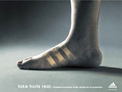
intercambio endiadis

Figure 2

This adidas advertisement shows the 3 stripes on a foot without the shoe, but instead with band-aids to show the pain caused when you don’t wear their shoes. Might look similar but the outcome (content) is different.

Homology

Being the opposite of Hendiadys the content is the same but comes in a differently formed shell. 
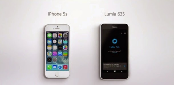
apple-iphone-ad-homology

Figure 3

The two phones compared have similar capabilities but come packaged in different form and materials.

Asyndeton

When there is a logical disconnection and the viewer can sense that something is missing in the image.
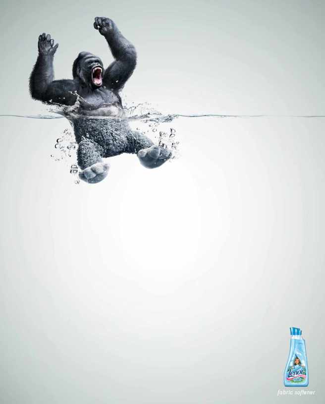
gorila-nuevo

Figure 4

A teddy or soft toy represents something that is comforting and incredibly soft. The link that is made is that anything can be put into the wash using this fabric softener to become as soft as a teddy.

Anacoluthon

When the grammatical sequence is either poorly presented or missing in the image entirely.

SP_PR.indb

Figure 5

The message of this adidas advertisement is very unclear to the viewer and asks them to think about it further. Perhaps this is a great tactic to use to keep the advertisement, and in turn the brand, in the viewers mind longer than it otherwise would.

References

Chiasmus, Literary Devices, viewed 11 February 2016, <http://www.literarydevices.com/chiasmus/&gt;

Durand’s Rhetoric, Changing Minds, Jaques Durand<http://changingminds.org/disciplines/rhetoric/durand_rhetoric.htm&gt;

Ejemplos de aplicaciones retóricas, 25 May 2015, Hexadecano, viewed 11 February 2016, <http://hexadecanounlz.blogspot.com.au/&gt;

Figures of Exchange, 31 January 2015, Design Studio – Visual Language, viewed 11 February 2016, <https://aflintvisuallanguage2014.wordpress.com/2015/01/31/figures-of-exchange/&gt;

Lenor Fabric Softener: Gorilla, Grey, Lima, Peru, April 2012, Ads of the World, viewed 11 February 2016, <http://adsoftheworld.com/media/print/lenor_fabric_softener_gorilla&gt;

Sony Microvault Tiny 4GB: Banana, Ads of the World Fortune Promoseven , viewed 11 February 2016,<http://adsoftheworld.com/media/print/sony_microvault_tiny_4gb_banana?size=original
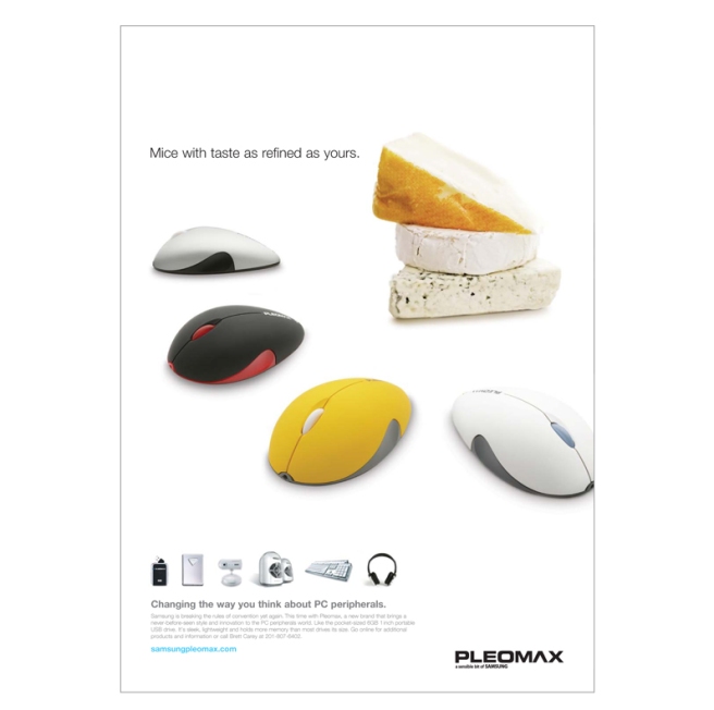
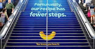
&gt;

Week 10 – Substitution

Rhetorical substitution can be found in different forms. According to Dyer (2008) “substitution is where one thing replaces an [another] in discourse”. This is a very commonly used form of advertising, as it draws in the viewer and makes him or her think about what the “real” message of the advertisement is supposed to be.

Some of the forms of substituion include:

1. Identical substitution

Where one object or idea replaces an identical object or idea.

Species02_print

A very commonly used example of identical substitution where a real life image on some sort of a screen is placed in a setting where the image might exist to show the exactness of the object. In this case it is to show how clear and true to form the screen on a samsung is.

2. Substitution of similar elements

When something is replaced with a thing that shares a mutual connection for the viewer to understand the message.

Pleomax3_print

While this advertisement uses varying types of substitution (including false homology) it also uses similar elements. The viewer associates the computer mice surrounding the cheese with real mice who love cheese.

3. Substitution of different elements

When something entirely different is put in place of something, but a thing that holds same connection or connotation.

15788b8db54c133186d742fb110bd364

Apple MacBook being displayed as an open book with pages fluttering in order to give the meaning that there is a book (perhaps countless) that you can find with the uses of a MacBook.

4. Substitution of opposing elements

Using opposing ideas to communicate a message in an obvious way.

volkswagen_lemon_hires1-236x300

Usually cars that break down often or seem to have various problems are called “lemons”. Volkswagen cleverly captures the viewer’s attention putting the word underneath to explain how they “took the lemon out of the car”.

5. False homology

A play on words to bring thought and attention to the message.

download

Kraft Mac’n’Cheese’s advertisement uses false homology in that it’s saying that preparing the dish is quick because it doesn’t require many steps, written on what seems like a long staircase.

References

Advertising for Communicaton, Dyer, Gillian, 2008, pg 139

Advert for Apple MacBook, DeviantArt, date unknown, viewed 10 February 2016, <http://i-visual.deviantart.com/art/Advert-for-Apple-Macbook-52343386&gt;

Kraft Mac & Cheese Ad – 9 Figures of Speech that Will Make You More Creative. 2015. 9 Figures of Speech that Will Make You More Creative, viewed 10 Feb 2016, <http://thevisualcommunicationguy.com/2013/10/18/9-figures-of-speech-that-will-make-you-more-creative>

Lemon, 26 Feb 2009, Writing for Designers, Coleman, Rebecca, viewed 10 February 2016, <http://www.writingfordesigners.com/?p=1731&gt;

Pleomax Advertisement, In Print, Paige 22 – Billboards, Print Advertising, viewed 10 February 2016,<http://www.paige22.com/inprint/&gt;

Samsung Advertisement, In Print, Paige 22 – Billboards, Print Advertising, viewed 10 February 2016,<http://www.paige22.com/inprint/&gt;

Project 3 – Progress

While the topic and the original ideals have stayed the same, the presentation of the outcome has somewhat shifted for the posters.

All 4 posters will go with the theme of what and how we are teaching children (primary school aged) about the refugees.

The concept came to me when I was exploring the idea I had for the rhetoric of exchange and chiasmus – showing the innocence of a child and what they would do if it were only up to doing what they knew.

I’m still developing the final ideas but each poster will have a large blackboard on it and will look like it’s hanging in a classroom.

For Suppression (using ellipsis and suspension) it will have the words to “Advance Australia Fair” written on the board with the ones that are politically not applicable crossed out in red to show the message that we don’t mean those words anymore so they should not be sung in out national anthem.

Preview:

Screen Shot 2016-02-10 at 7.20.28 PM

Project 3 – Progress

It has been interesting for me, not only for the Poster assessment, but also for the previous Transformation Object Assessment to record my progress like this.

The main reason for this is that it is an opportunity of reflection to see how ideas have developed the more I’ve learnt and the longer I’ve worked on an idea.

With the Transformation Object, the final outcome, while retaining its original purpose, was a completely different product than the first idea that I had. It really goes to show how important the process is and how much depth this can add to the final outcome. I’m interested to see how this assignment pans out in this way.

For the Poster assessment, I have chosen the topic of “Refugees”.

I want to create posters that show the statements of politicians and some members of the general public in a way that looks and sounds ridiculous to anyone reading it out of context. To show that many of the sentiments expressed and actions made against refugees trying to flee to Australia are extremely inhumane and horrible. The posters are to remind us that we are all humans and are not born with this prejudiced hatred – that it is what we are taught and that we need to change this.

Possible tag lines and figures of rhetoric to represent:

ADDITION

“See no evil, speak no evil, hear no evil”

Depicting 3 politicians (Turnbull, Dutton & Morrison) covering their eyes, mouth and ears to a backdrop of a boat filled with refugees (only held up arms visible – another form of addition).

SUPPRESSION

“Theres no room for them”

Showing a large map of scarcely populated Australia. This idea needs more development.

SUBSTITUTION

Picturing in some form a desperate Mary and Joseph being turned away by the people of Bethlehem – comparing Australia, a proclaimed “christian nation” turning away refugees who desperately seek refuge and safety.

EXCHANGE

A child dressed as a political leader saying we should take refugees. This is showing the child’s innocence and reinforcing that we are not born prejudiced to hate or be scared of people that are different to us. This is using chiasmus.

Week 09 – Figures of Supression

When the rhetorical figure of suppression is used to communicate a message or idea, an element of the message is removed or excluded (Durand) as the name says, suppressed, in a way that it is obvious and clear to the reader what it is trying to say.

Let’s look at an example:

FordKeySkyline

The above is a car advertisement by Ford and uses the figure of suppression by not showing a vehicle at all. Because there’s a key which is shaped as that of a city’s skyline, we can gather that the key represents the car that gets us to that city.

Both figures of ellipsis and circumlocution are produced by this ad, because by eliminating an image of a car but replacing it with a key and destination, the message is still received. According to Burton, BYU, circumlocution means “talking around something usually by supplying a [description]” of something else.

The use of a metonym is apparent here as the key is the representation of the car – the key essentially being a part of a car.

Substitution is also being used in this advertisement in the form of a metaphor: the car is represented by a corresponding sign, that of a car key.

Although suppression does not attract as much attention as some other forms of rhetoric might, such as addition or substitution, it can still be very effective in spreading a message.

References:

Car Hoots, 20 of the Best Car Ads, 23 April 2014, Adam Barsby, viewed 23 January 2016, <http://www.carhoots.com/top-10s/top-car-print-ads/&gt;

Rhetoric, Burton, G, viewed 23 January 2016, <http://rhetoric.byu.edu/Figures/C/circumlocution.htm&gt;

Durand’s Rhetoric, Changing Minds, 2016, viewed 10 February 2016,<http://changingminds.org/disciplines/rhetoric/durand_rhetoric.htm&gt;


Figures of Addition

Figures of addition are used in different forms of media, such as advertising by adding a word or image to emphasise the message.

Repetition:

As for the rhetorical operation of repetition, it “combines multiple instances of some element ofthe expression without changing the meaning of that element” (Macquarrie et al, 1996, p. 429). It’s purpose is to produce emphasis, clarity or emotional effect.

The below image uses repetition to draw attention by using two large signs right next to each other.

cool-billboard-ads-11-500x320

Figure 1. <https://bdaumas1.wordpress.com/&gt;

Similarity

This Coca-Cola ad uses similarity to showcase different types of forms the drink comes in, in an obvious way. They all share a particular quality.

coca-cola2

Figure 2.

Accumulation

To convey a message by “bringing together a number of points into a poweful conclusion” (Changing Minds, 2002) The below image represents the different elements of a meal, brought together in an organised fashion – not how you would ordinarily see it prepared on a plate.

sushi-accumulaton

Figure 3.

Opposition

Opposition can be used to create a contrast by having conflicting elements (Changing Minds, 2002). The cars below are a comparison of old and new. Black and white elements are often used to heighten the contrast and is done well in this advertisement.

11

Figure 4.

Double Meaning, Ambiguity & Paradox

Another great attention grabbing method by a play on the difference of appearance of reality. The ad below is a showing a lipstick with a leg coming out of it to showcase how the lipstick can transform the user.

ambiguitiyFigure 5.

References

Transformation Object Progress – 3

From match-up squares to weather (colour) wheel:


As the aim of the sequence game was to match up different natural states to create another the colour wheel came to mind, since elements were used multiple times throughout different sequences. By having an wheel comprising of two disks, the inner one with words and the outer with images, it felt like it could be more of a game to the child, as opposed to just matching 2 or more cards to an outcome. 

To start I researched different styles of the colour wheel to find out how best to execute this, using 2 disks (principle used: materials).

Picture1

Wheel of Colour, 12 January 2012, Helz Design blog, viewed 27 December 2015, <https://helzdesign.wordpress.com/tag/complementary-color/&gt;

I decided on 6 states or outcomes of whether to go on the outer wheel in the form of images drawn by me in Adobe Illustrator (an opportunity to challenge myself in Illustrator) and 8 forces to go on the inner disk.

Physical mock-up before digitalising in Ai:

IMG_1526IMG_5690

6 – Design Elements: Let Type do the Talking

514bab0bf54344cd0fc2c28ea15323f5

Typography can often be heard described as the most personal form of design and one of the most important elements in communicating through design.
Today, throughout history and particularly the industrialisation period type played a huge role in creating a brand identity for a company. Those companies who have stayed successful throughout those times can still today be recognised within each era because of their logo or perhaps a typeface that has been primarily designed for them.

coca-colavogue

Both of the above images are examples of well-known brands using their regular font and using a different font. This shows that without the type that people know the brand by, the logo completely loses it’s meaning and in the end is just a word.

Type can also be effective in advertising when used in a very obvious and visual way. The below ad plays on the song “I want Candy” using bright colours and making it look desirable – despite it being an anti-sugar campaign. experimental-typography-candy

Image sources:

5 – Design Elements: History & the Grid

Throughout history, with technology constantly evolving, so has and does the way we design. It is not only influenced by techonology, but through events and eras in history itself.

In the pre-modernist era, before the invention of movable type, the majority of books were religious manuscripts, which were one-off copies. The way space was considered and designed had to do with the context of the publication and theme. Text, not negative space, was the focal point.

During the modernist era, through people like Descarte (mathematics and geometry in designing space), Malevich and particularly Josef Mueller-Brockmann, the philosophy of how negative and positive spacial areas are used was much more considered. Mueller-Brockmann was especially well-known for his use of grid systems in almost all of his designs.

Examples of grid design theory by Josef Mueller-Brockmann:

(1)Grid System
(2)
infographicsdesignmullerbrockmannposterswiss-b967ccfbaff29dcfa76f2542fe4f7c2a_h

Post-modernism saw a disjunction with modernism and more playful and inventive designs. For example, elements of pages in publications were assembled in new and conventional ways they hadn’t been before.

Image sources:

(1) Grid Systems in Graphic Design/Raster Systeme Fur Die Visuele Gestaltung, Abduzeedo, published 23 August 2014, viewed 26 December 2015, <http://abduzeedo.com/grid-systems-graphic-designraster-systeme-fur-die-visuele-gestaltung&gt;

(2) Behind the Poster, Designblog, published 13 November 2011, viewed 26 December 2015, <http://designblog.rietveldacademie.nl/?p=18904&gt;

Transformation Object Progress – 2

Initially I wanted to produce some sort of learning material for children. I was immediately drawn to creating a book as I personally have a learning connection with books and thought I could learn something along the way.

After coming up with my initial idea (below) I felt stuck in how to tie multiple semiotic principles into it and unhappy with the initial idea.

 New educational concept: match-up squares.

A number of cardboard squares with weather related images on them to create natural weather sequences, to teach the child basic science ie. How rain happens.

This game would be played with an adult and a child – the adult verbally teaching the child and using the cards as visual cues to help children identify weather states without having to read.

Semiotic principles:

  • Signs – the words making up the images
  • Signifiers – the images representing states and objects of the weather
  • Connotations of Colour – presented with images of bright colours as the game is designed for children in order to look more fun and excitingIMG_7627